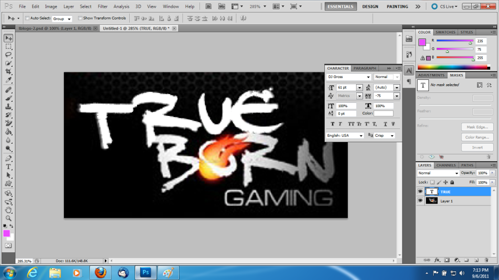
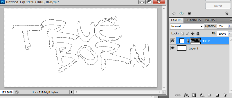
First attaempt at TBG Logo for side project.

RainMotorsports

Leadership
Leadership
Joined
Mar 6, 2011
Messages
8,648
Alright so its not quite.... there yet. I was hoping to get something I would be happy with by today but no luck. The gaming part despite using the same font needed alot of tweaking in spacing, etc to get where it is and its definitly still off a bit.

Sample:
tblogo-3.jpg


The fireball shape actually seems to have originated here:
fireball.jpg


You cut off the extra shit and recolor it, seems exactly like it? Thats until you try to match it up with the one in the logo and it seems to still need some tweaking.

Anyways can I get anyones "Nearly There" approval since Im giving up for the night?

It wont actually be on a black background for the project and you all will see it soon enough.
 
Cool, when you get ready to share, I can have some banners made. And if I can use it for the TBG paint for my cars.
 
Cool, when you get ready to share, I can have some banners made. And if I can use it for the TBG paint for my cars.

I actually thought of you when I was doing this. I will probably start with a much larger original as well for my second attempt alltogether.

Ill send you a psd when its done. Once my projects done its pretty much open to anyone to be honest.

EDIT - Whoever designed this logo had a real hardon for font spacing...
 
can i have it too, im going to have made some underwear with this, to think about u everytime i use them.
 
Give it to chivoX to put it in his underwear, LOL.
 
What fonts are used? And if you dont mind, I'd love a copy of the PSD
 
I think the letters are individual layers, not normally spaced as if they are on one layer. And the font good luck, I have yet to find it.
 
I think the letters are individual layers, not normally spaced as if they are on one layer. And the font good luck, I have yet to find it.

Yah anytime i had a desire to create weird spacing like that, it's easiest to make it its own separate layer.
When in doubt, make another layer!
 
Yah anytime i had a desire to create weird spacing like that, it's easiest to make it its own separate layer.
When in doubt, make another layer!


At the font size I used its close to -75 letter spacing to create the desired effect I tried it out before I passed out.

You know there was this dude named beaver making tshirts with our logo on it. If you needed the font all you had to do was ask!

DJ Gross

The true (at the size i was making it) has a -5 degree rotation on it, approx.

Ive asked more than a few times:-p Was told no one knew what it was except the original designer of the logo. Whats the font for the "Gaming"
 
Ive asked more than a few times:-p Was told no one knew what it was except the original designer of the logo. Whats the font for the "Gaming"

Sorry about that, Eurocaps though and maybe its because I am working at a larger size but it doesnt match the shit in stock form at all. The height is approx 80% though i increased width after that so thats not true but then letter spacing as with everything else.

As soon as I am done watching top gear I will start working on my new attempt.
 
Working over a non enlargened original. At 61 size, -75 spacing and a transform rotation of -5 degrees. True is damn near perfect.

true.png


I am going to make my adjustments over the original logo to get the measurements right before i start redoing a much larger master.

EDIT - Born which isnt rotated, same thing Size 61 with -75 letter spacing damn near perfect, the AA method actually makes up the variance just about in any direction you want it. Now for the gaming...
 
The font for gaming might not be what I was told it is lol.

Seems to be more like a Microgramma Extended so I am going with Waukegan Extended. Seem to be getting closer matching anyways.
 
If i didnt have to get up i would finish this right now.

Anyways preview of the type of files that will be available. The entire true born gaming part minus the fireball will be available as one shape. You will be able to size it to the file your working on before rasterizing for the best quality and it lets you do alot more with it then the master logo file.

Untitled-3.png


The fireball is already also a shape. You would still have to add it in at this point. Not a photoshop expert but hopefully can add that in too and still control the color seperately. If thats done then all you have to do is size and drop your light on it.

Of course a finished logo on a transparent background for those who don't want to mess with photoshop much.

Finish tomorrow i guess. Still tweaking gaming but its much closer than the first logo i made. Add it to the shape soon.
 
Back
Top