What really goes on during our film sessions

MotherMan

Registered User
Joined
Feb 13, 2011
Messages
563
Age
33
I went to the bathroom while filming, came back, and found my actors like this. Tell me what you guys think about the logo use.

<iframe width="560" height="315" src="http://www.youtube.com/embed/Hn3fvwUAWQw" frameborder="0" allowfullscreen></iframe>
 
I think the logo should be twice that size, and give it a smoother transition too if possible
 
It was fun to do :) 3 hours for 15min's of video but 2h 45m of laughing :) Can't wait to see it done!!!
 
I think the logo should be twice that size, and give it a smoother transition too if possible

Well he is working off the old one thats really low res.

I was working on a recreation of our logo back before never finished it. I was planning on doing that one as well as a couple others for our videos so hang in a couple days. I will put it on the top of the list.

Edit - Goods news and bad news on that. PSD seems to be missing but 75% of it takes like 5 minutes... bad news is the rest of its gonna suck lol.

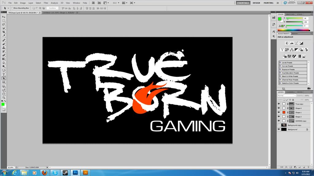
Here is a low res sample of the original attempt. The main thing was getting the fireball right, but I had a second attempt that got the font spacing and angle correct as well as fixing the gaming front and tweaking the fireball.
tblogo-3.jpg

But dont be afraid to jack the one being used in Teamspeak or come up with your own. After I get our familiar one done I intend to make as couple myself inspired by our alternate logos.
 
Alright the text vector is done. This time I am working at a higher resolution than the source logo for the vector. This will provide details present in the font not actually in our logo. Rendered at lower resolutions they wont be present. No one will notice and theyre not meant to.

As before I dont have the proper font for gaming. I was told it was Eurocaps but last time I messed with it I could not get it anywhere near right. It appeared at one point to be a commercial font called Microgramma Extended. The closest free one is Waukegan Extended. Looks good enough to me.
logoprogress.jpg


If you want to attempt it yourself here are the photoshop instructions for the main bit:
- Font is DJ Gross
- Born is not rotated but True is rotated -5 degrees. Both use a font spacing of -75.
- At the original size (old banner) the font size is 61. Use Born to set your font size then perform the rotation on True.

- Gaming is up to you.

Next up is to draw a vector of the fireball. The original the artist used as i stated in the past this image with modifications. I just found out today its actually a common stock vector.
fireball.jpg

Originally I traced this shape. But the modifications to the shape to fit it inside the lettering was not quite straight foward. This time I will trace the fireball in the header image instead. I recommend coloring it a very very dark orange and then using the lighting effects filter to give it the color gradient. The last complication is the O needs to be cut.

The completed logo has lighting effects applied to it as well. I never decided the settings for it.
 
Alright more progress on your logo motherman:
Untitled-2.jpg


Vectors done and the lettering is now cut to allow the proper overlaps. Never actually got that done properly last time. Pretty much down to lighting and maybe a little glow effect on the fireball outer edge. I didnt cut the O in respect to adding the glow in the logo so not going to be able to throw much on it without redoing the cut.
 
Back
Top